

Bootstrap is a very nice framework developed with the concept of “Mobile First”. Through it you can easily develop layouts that works perfectly on all screen sizes. It is very easy to use and the main principle is that the screens are divided into twelve spaces, therefore you define how many spaces these twelve your information should occupy.
From a look at their website: http://getbootstrap.com/
It is full of examples and use cases.
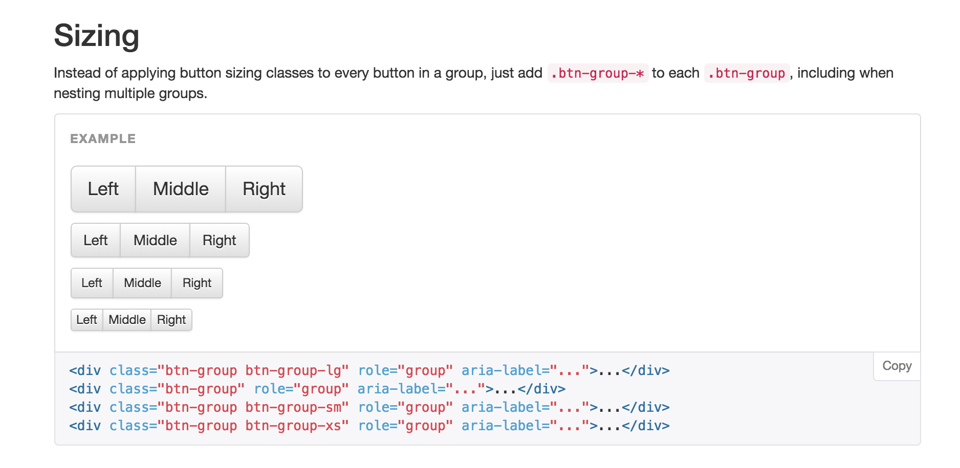
Note that in addition to the spaces you also define the size of them. You need set the size of this spaces, if is for very small screens, small, medium or large respectively through the css class (xs, sm, md, lg).
See the example below for you to understand better.
All examples and use cases : http://getbootstrap.com/components/
 www.Dev4Devs.com